After 45 years of incredible and complex work, the Pacific Legal Foundation asked our team to help them bring their website into the modern era. I led a team of designers and developers in de-tangling nearly five decades of cases, content, and user journeys, and creating a modern design framework for presenting relevant, powerful stories and clear, user-friendly features. We increased their online donation revenue by 4,900% in the first month, and 1,000% per month thereafter.
Start with the gnarliest part of the knot
Pacific Legal Foundation is a non-profit law firm that defends Americans against egregious government overreach and harassment. They're like a slightly-more-land-rights-focused ACLU, and (until this year), they've joked that they're the best kept secret in non-profit law.
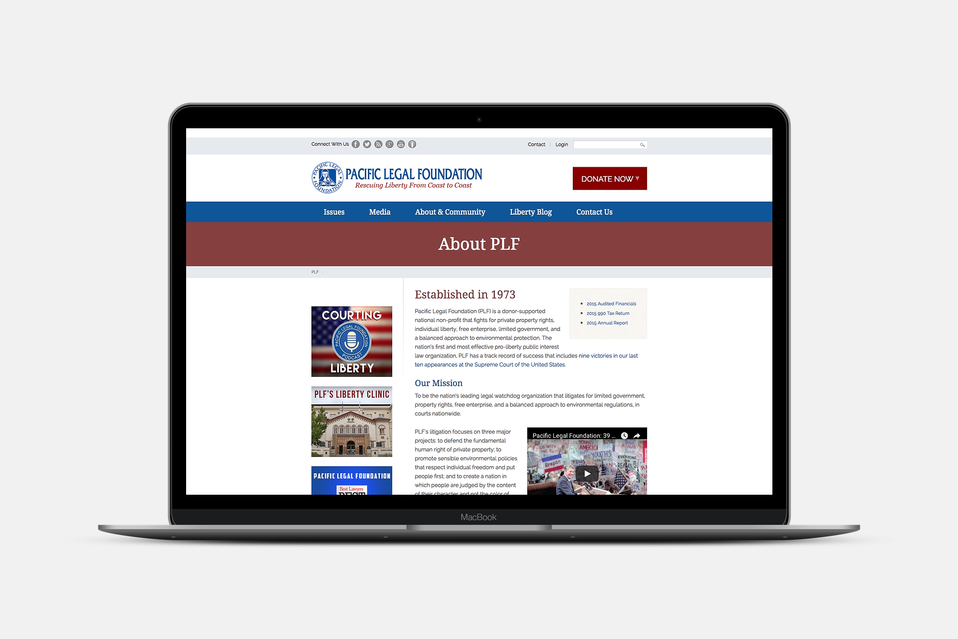
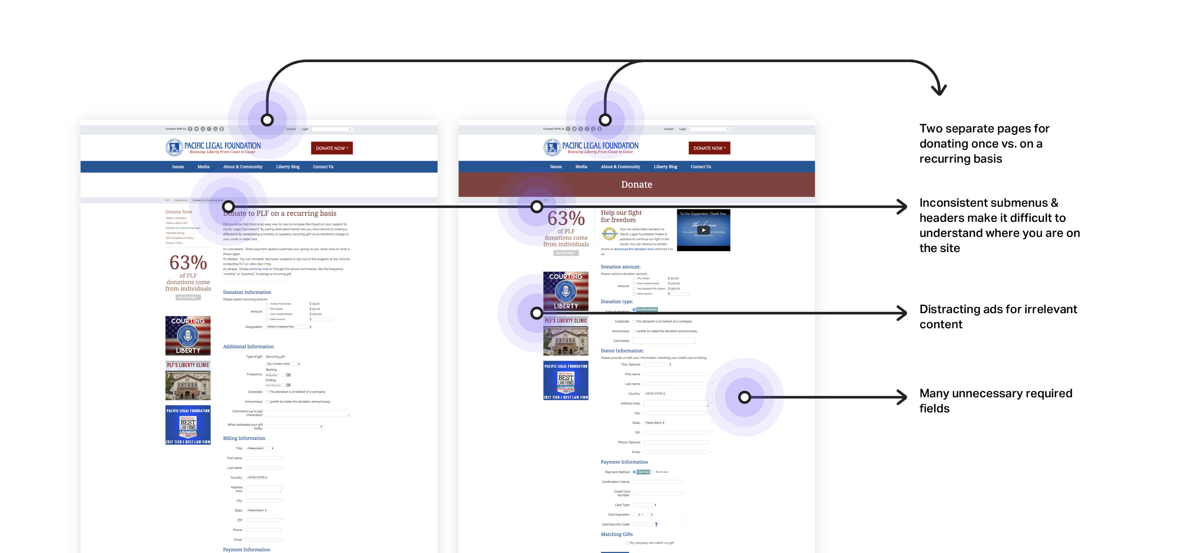
Their website hadn't been updated in quite some time, and wasn't reflective of their cutting-edge work in the legal field. Their staff hated it, their donors hated it, and pretty much every stakeholder we talked to described it as a "total mess."
Q: In your opinion, what is the single most important feature that is currently missing from pacificlegal.org? Why?
A: Usability. For instance, somewhere on the site is a page about our San Joaquin Valley project. Where? I don't know. There's no obvious way to navigate to it.
— from our Discovery Survey
PLF knew that their site could be doing more business for them, and one of their top priorities was designing a product that better communicated their brand as a thought-leader, and sparked new relationships with potential donors. They also wanted to start planting the seeds for a relationship with younger donors, who were increasingly demanding a better online experience, and to foster more productive relationships with reporters, who were frustrated with how hard it was to find information on their old site.
Identifying the Opportunities
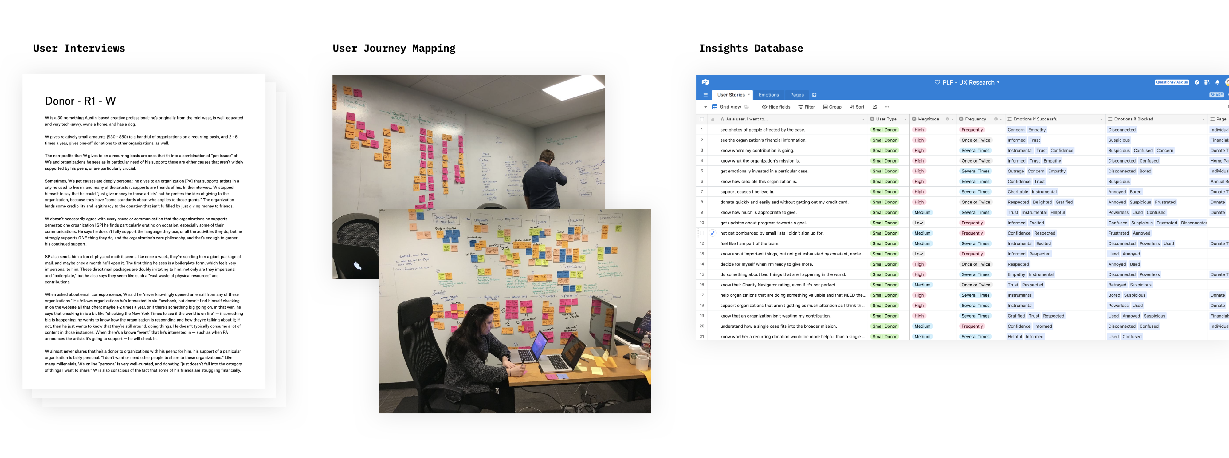
After 8 user interviews with key user targets, we identified the following major insights that we wanted to test further:
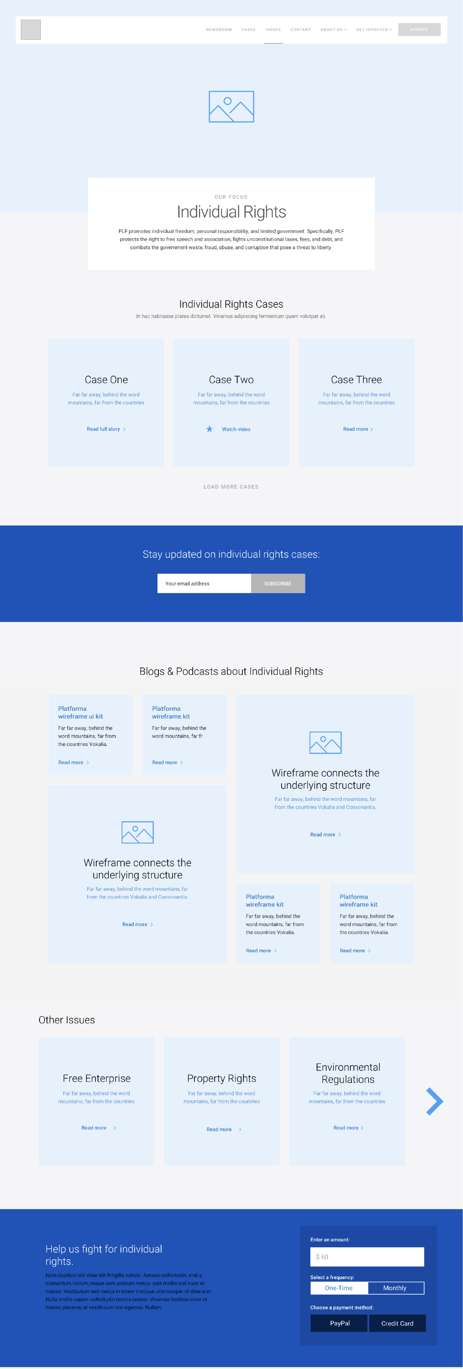
#1 Stories drive action
What we heard immediately from both user groups was that real, compelling human stories were the most important thing. Donors and Journalists alike were searching for compelling stories, and they walked away the millisecond jargon-y legalese got in their way of understanding why something was important.
Though PLF is an ideologically-driven organization, we found that most of our interviewees didn't really think of their donations in that way. Donors absolutely had political opinions and subscribed to certain ideologies, but when it came time to donate to their favorite organizations, their motivations were incredibly practical and specific: "X organization is working on this very specific case that I care about," or "Y organization is always getting things done." We took this as further evidence that we should focus the design around specific cases, rather than on broad issues.
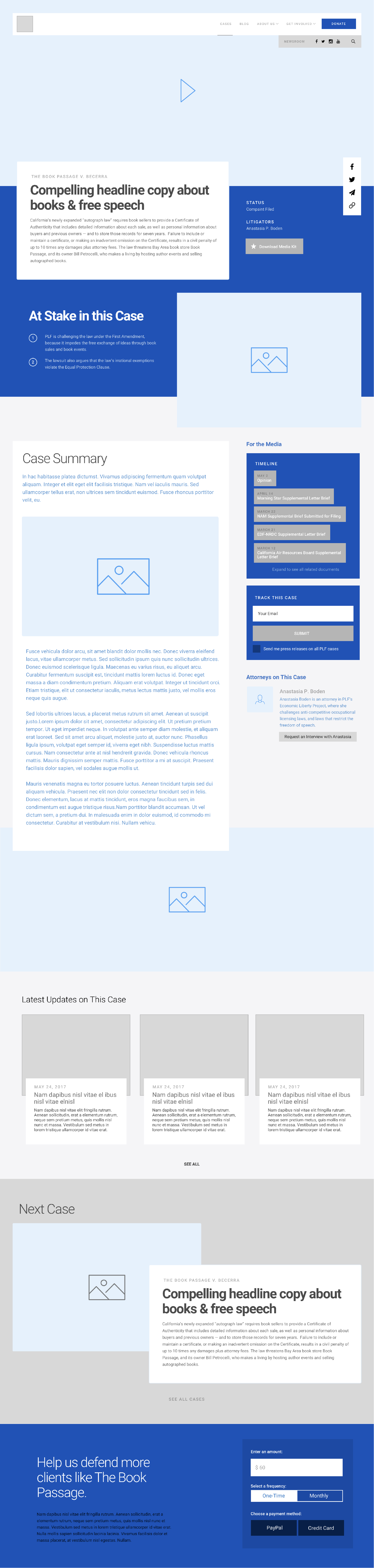
This [the case page] is definitely my favorite page. I want to see more like this. — usability study participant
I guess don't really think about issues in that way? — usability study participant
#2 Donating is an emotionally loaded transaction
Even really enthusiastic donors told us that they frequently didn't know how much they were expected to donate — and this "awkwardness" occasionally stopped them from donating at all.
Even after someone had decided to donate, we heard over and over that feelings of shame or confusion about donating the wrong amount (specifically, less than the expected amount) prevented a handful of users from donating at all. We saw this as a huge opportunity to help the organization and enthusiastic donors communicate with each other better, and hopefully improve conversion rates.
We also heard from our users that they didn't love the idea of giving more personal information than was absolutely necessary. After some talks with the donations team, we agreed that we could make the mailing address optional — and they agreed to let us test putting it after the donation was complete.
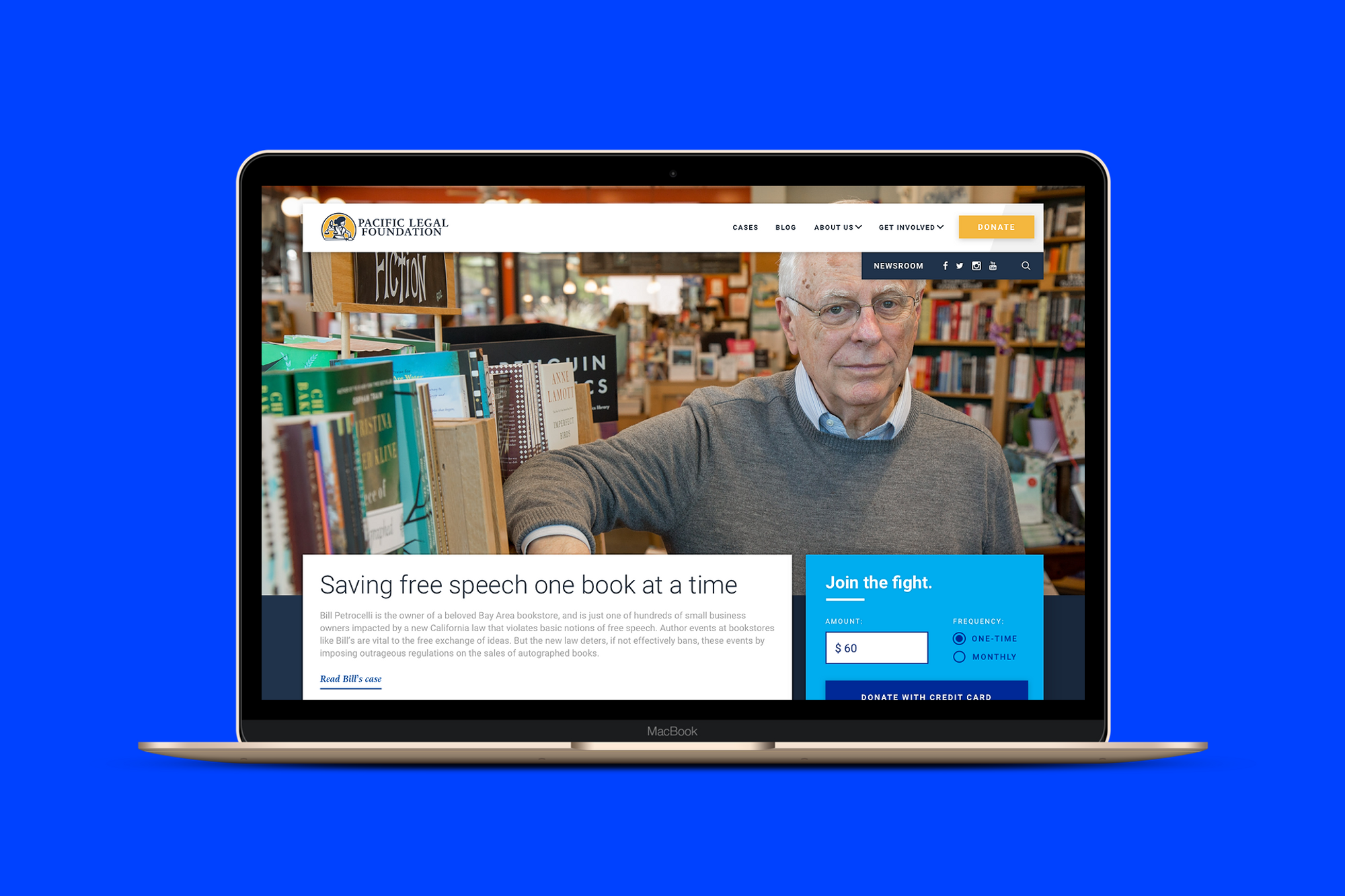
Cluttered, incredibly long, and filled to the brim with required fields, the donate form was our first order of business. We tasked ourselves with reimagining their 5-step, 27-field donation process as a 4-field widget that could be included on other pages, in the context of compelling stories and content that might inspire users to donate.
The results were fantastic: not only were users less wary of the donation field, they were actually more willing to give their mailing address when it was attached to a "welcome kit."
This is great. Another organization got me so many times last year because they kept sending me emails like "Donate now to get this sticker!" and I was like hell yeah I want that sticker. — usability study participant
Even if I never use the buttons or stickers — if they just sit on my desk — I love them. They make me feel like I'm part of something. — usability study participant
We also wanted to help solve the problem of uncertain donation expectations. In interviews, donors told us that they weren't sure how much was appropriate to donate, and while donors in our age group were budget-conscious, they felt uncomfortable about donating "too little". When facing dropdown boxes or radio options for donations, they told us that they "felt stingy" if they chose the smallest amount, but frequently just couldn't afford the larger amounts.
So we decided on a design pattern that used a single, pre-filled text box for the donation amount instead of a dropdown menu to try to streamline the process even further, and give users a strong signal of what kinds of donations we really wanted to capture.
I feel like even a small amount can make a difference. — usability study participant
$60 seems higher than what I'd be inclined to give naturally, but not by enough to make me not want to donate. It makes me think there must be a reason for that amount. — usability study participant
This pattern tested remarkably well. We were concerned that the donation amount might be too high — that it might signal to users that smaller donation amounts weren't welcome — but that turned out not to be the case. Most of our test users felt the pre-filled amount was a nice anchor for what was expected, and felt no qualms about changing it to an amount they felt more comfortable with (higher or lower). Whereas radio buttons "felt manipulative," as if the site was trying to make them feel guilty for clicking the smallest one, this pattern "felt flexible" and "open."
In the first 6 months after launch, donations of $60 were the most frequent donation amount, further validating our pattern.
#3 Journalists need different things on different screens
But donations weren't our only concern. PLF also had hundreds of cases, thousands of blog posts, and a massive library of podcasts, photos, videos, and other media they wanted to make more accessible. In particular, they told us, they wanted to create a framework for a more productive relationship with reporters, who frequently came to their site looking for information and gave up.
We interviewed 4 journalists who regularly write on legal cases like PLF's, and a few usability themes began to surface:
- Don't make me hunt down related documents.
- Don't make me hunt down your press point of contact.
- Don't throw too much information at me on mobile.
In short: journalists wanted an overview when they were perusing a case on Twitter, and they wanted everything when they were finally ready to research and write their article on a desktop device.
We designed a new Press Release page that would focus on the big picture first, and designed a "case timeline" in the right-hand sidebar, so that journalists could see the big picture of the case at a glance and dive into more details as needed.
We also created a Newsroom page for easy access to journalist-focused tools, like the Case Lookup tool and the press release signup form, and completely overhauled the advanced search to be friendly on mobile:
Outcomes: How'd we do?
Despite an aggressive timeline, we completed the project on time and within budget. But more importantly, we nailed our task to increase online revenue: we saw a 40% increase in the average size of donations, and in the first 100 days of launch, the website generated sixteen times the revenue it had generated in the previous two years combined. Even after the holiday giving season calmed down, PLF saw a sustained increase in monthly online revenue of about 1,000%.
Key Results:
- 4,900% increase in revenue in the first month (from $4,082 in a year to over $200K in 90 days)
- 140% increase in the frequency of small donations (from 15 to 36)
- 188% increase in the size of small donations (from $60 to $173)