Emergent Order, a fun and out-of-the-box creative agency that catered to public policy non-profits, wanted to represent their company at a client's trade show. I was asked to come up with an idea that represented their unique, creative, tongue-in-cheek brand, piqued the interest of new potential clients, and — most importantly — wasn't boring.
The challenge
My task: create a wow-worthy, fun, branded experience for a straight-laced trade show, which would take up no more than 8'x8' and using materials that could fit in a single pickup truck. Oh, and try not to break too many rules of the hotel that was hosting the show 👀
My Role: I creative directed and experience designed the project from end to end, including writing the script and creating the story, designing the dystopian world in which the Escape Room takes place, and building the puzzles. I also designed and built the "app" which kicks off the story. I managed a team of designers and producers to help generate other deliverables, like posters, and the box-frame.
Creating the Universe
The first step in creating a great escape room is to develop the world in which it is set. Much like in digital experience design, it's imperative to have a clear audience target, and to understand and empathize with them. In digital products, your job as a designer is to understand the challenges your user faces, and to help facilitate solutions; in escape rooms, it's to understand the challenges your user faces, and to turn them into an exciting story.
So we began with the basics: who was our target audience? What did they care about? What were their biggest goals and greatest challenges?
The audience for this particular trade show was professional, and would be spending the week wearing suits and sitting in meetings. They worked in the world of public policy, with a bent towards individual liberties, and they were frequently challenged by large, bureaucratic government infrastructures. They also had a generally pessimistic view of governments, in general. They were likely relatively tech-savvy, but by no means "techies."
So we set our story in the future, and made the co-hero of our story a brave hacker, attempting to take down an oppressive, dystopian government. Our suit-wearing, smartphone-wielding public policy experts would have the opportunity to tackle their professional challenges in a new, hands-on way — with a little extra excitement and playfulness along the way.
🗝 Our key to success? We created a challenge for our users that they already cared about. Our game would not have been nearly as fun if it had been designed in an unrelated or random setting.
Anything can be a puzzle, but not everything is a good puzzle
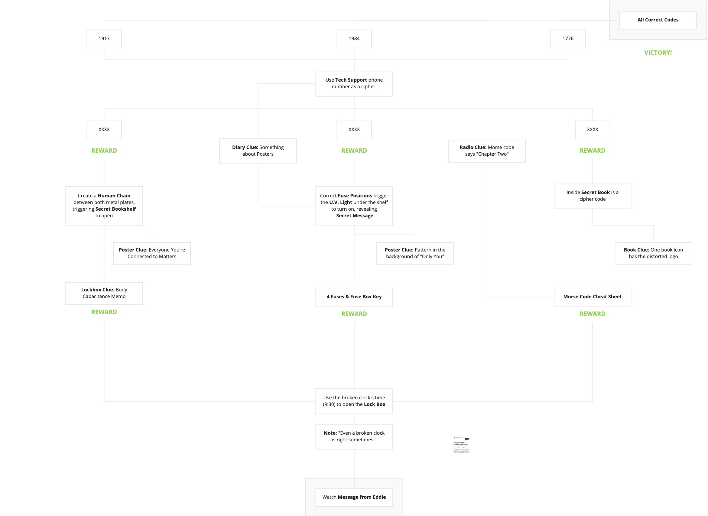
There are many philosophies on how best to design escape room puzzles, but, in general, puzzles that unlock other puzzles should be related. It's much easier to guess that a broken lamp is solved by a fuze box puzzle, than it is to guess that a broken lamp is solved by a code hidden amongst colored bottles of water.
It's very tempting to design an escape room narratively: one puzzle leads to the next, which leads to the next, and on. (See our first puzzle storymap below.) But much like in digital experience design, users often take other routes to different "features," and in an Escape Room, they might attack problems in any direction. For example, users might find the morse code you hid in a book, and then look for the radio puzzle to help them decipher it — or they'll see the radio, figure out how to turn it on, and only then realize they need to go look for morse code somewhere.
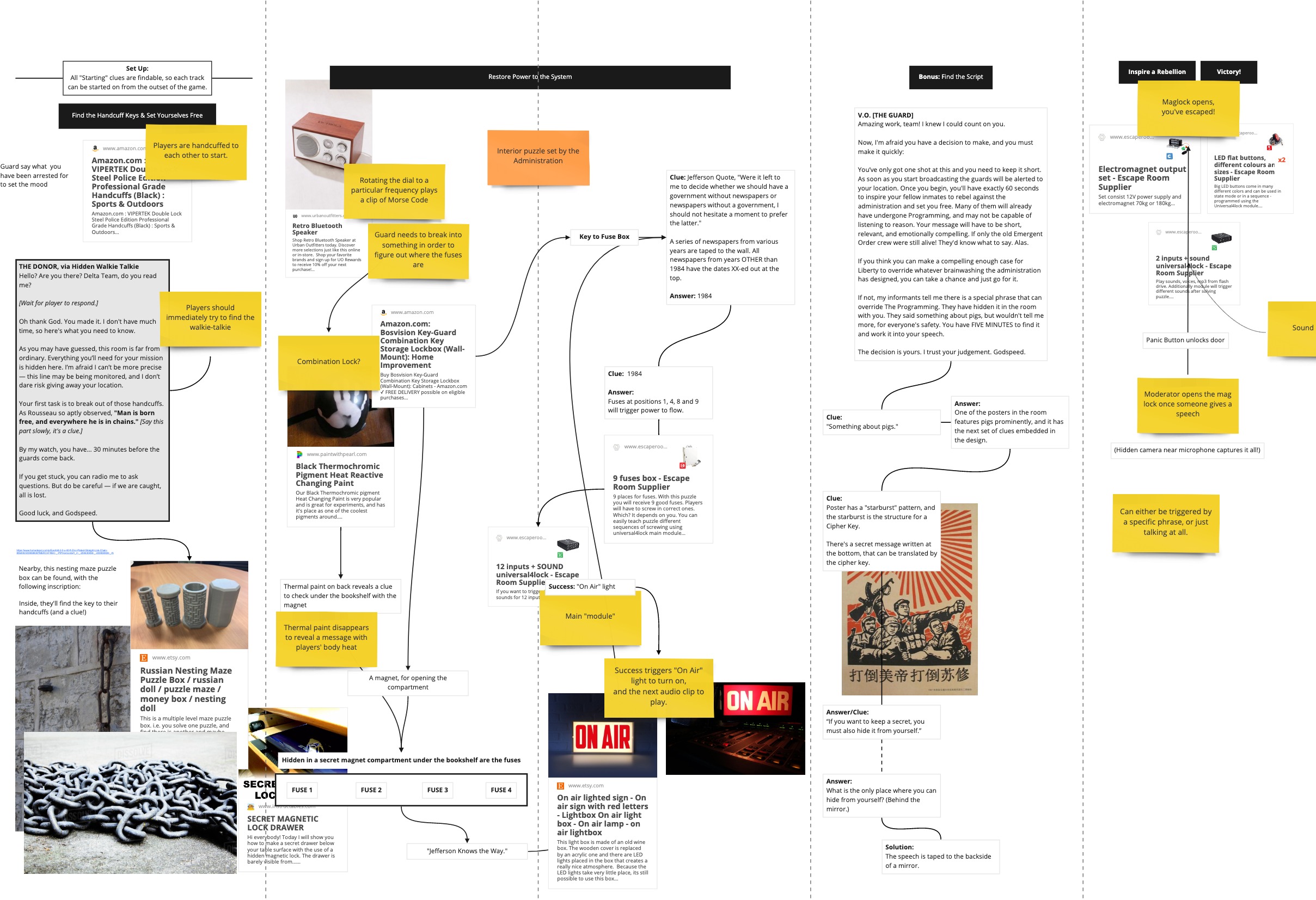
Giving users only one way "through" a storyline creates a kind of puzzle bottleneck: if users can't solve it, they're stuck. And nothing is more frustrating than getting stuck.
On the other hand, giving users multiple puzzles to solve and multiple ways to approach solving the puzzles allows users to bring their unique strengths and perspectives to the game, and keeps things moving even when one puzzle seems impossible.
We finally arrived at this 3-Keys-to-the-Main-Puzzle pattern, in which users must find 3 different codes (with 3 different, asynchronous puzzle narratives) to beat the game.
Test it, test it again, then test it another 20 times
We caught probably 30 bugs in the first five rounds of testing, and discovered a number of places where affordances needed to be much clearer.
For example, our safe was a bit finicky — you had to type the code, then wait a beat, then push star. But after just entering the code without the star, our first few users just assumed they'd gotten the code wrong, and went back to searching for a different code. We taped over the star button with a green sticker to better signal that functionality to users, and no one else got confused.
Even after the experience was "locked," we had to iterate and react to user feedback: After only the third "live" round, we had to write "DO NOT TOUCH" in sharpie on several boxes and to emphatically promise our users that there were no clues on the backs of posters, and that they didn't need to destroy anything to solve the game.
You'll Never Think of Everything
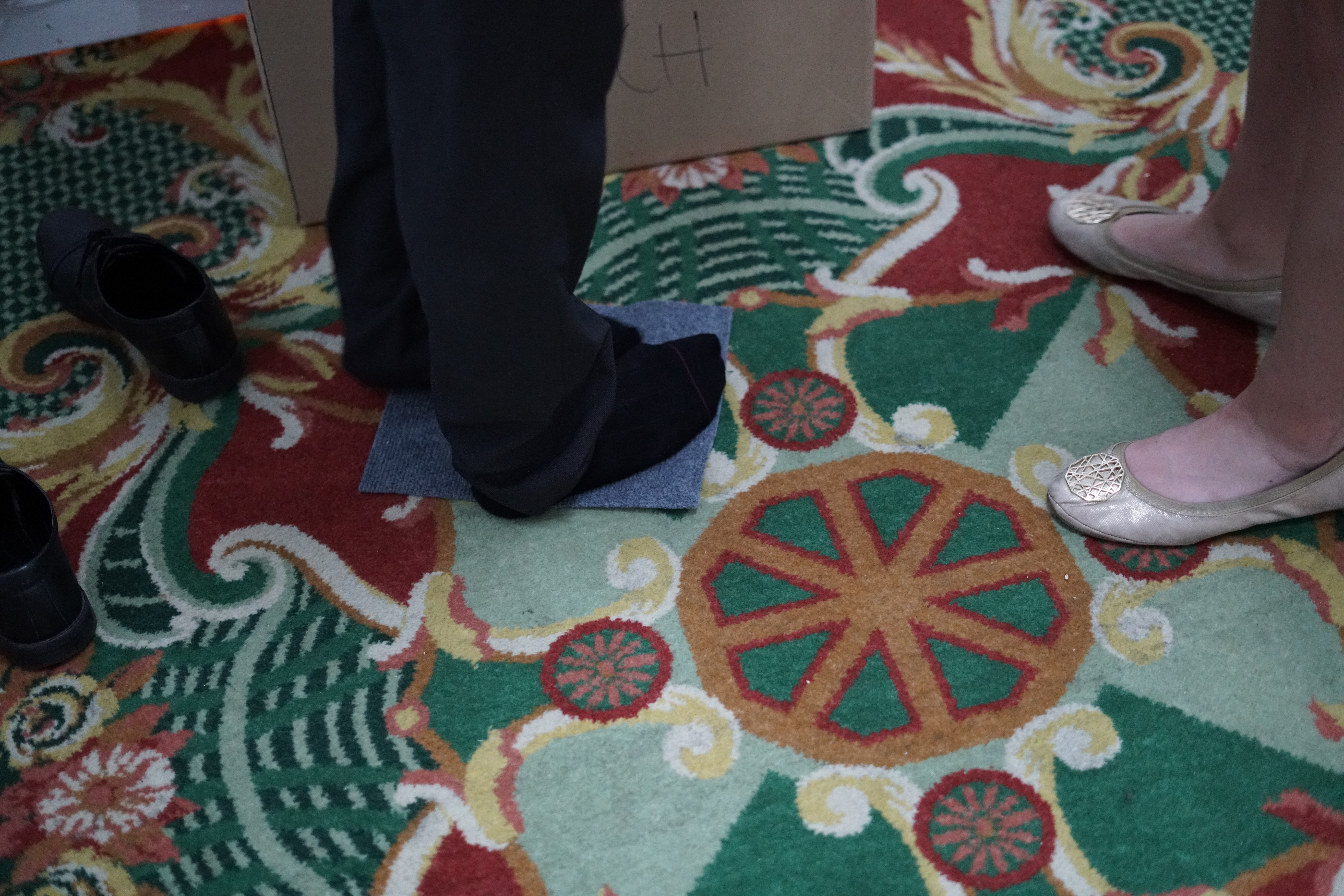
In design, we're always told that users will interact with your product in ways you can't even begin to imagine. This was no less true for designing an escape room: one participant discovered a felt pad stuck to the bottom of the safe — it came with the safe, and I thought nothing of it — and became absolutely certain that it was part of the game. He spent the entire game in his socks, trying to generate static electricity that he could discharge on... something, and was very amused & disappointed when we got to the end and it turned out to just be a felt pad.
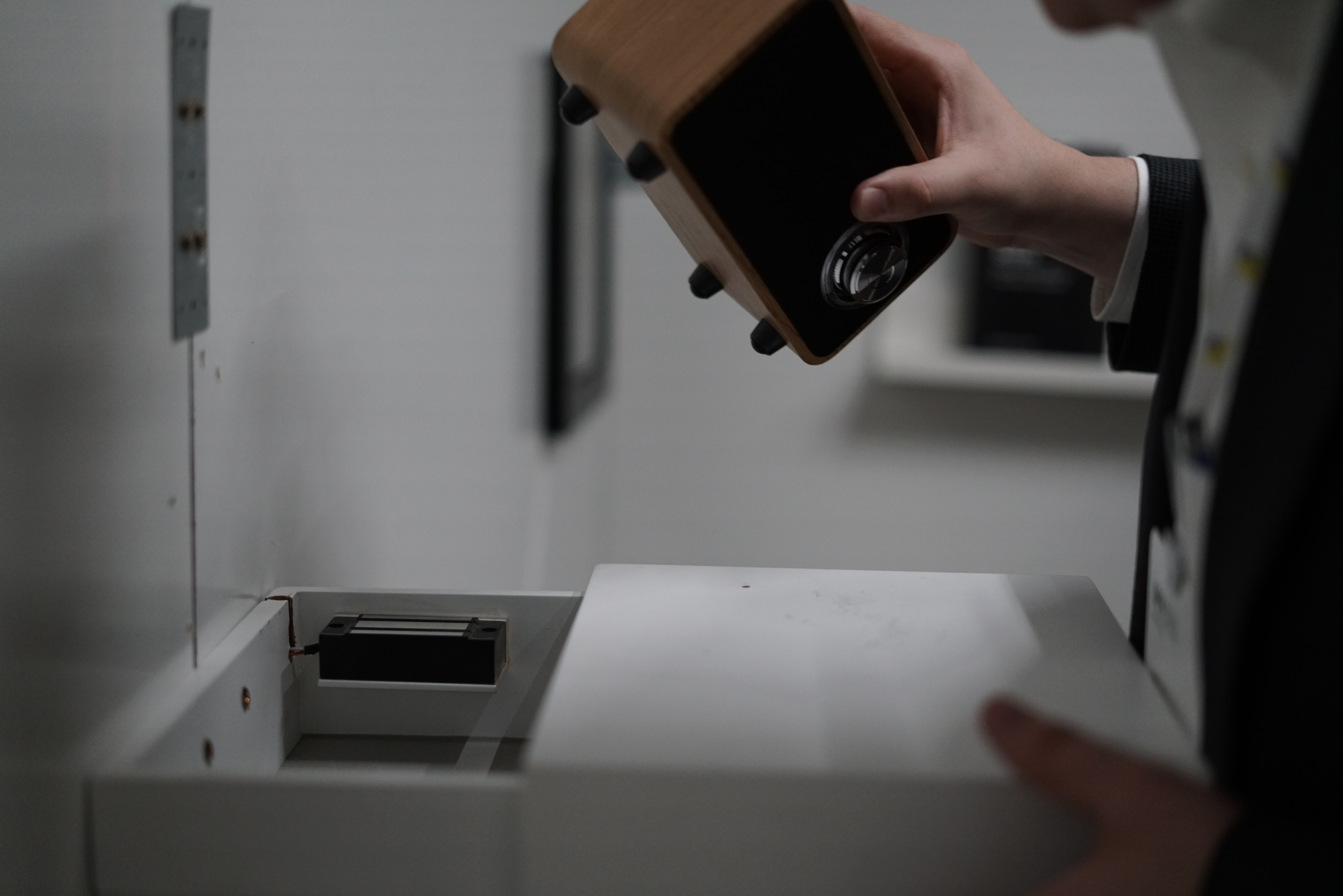
Bringing it to Life
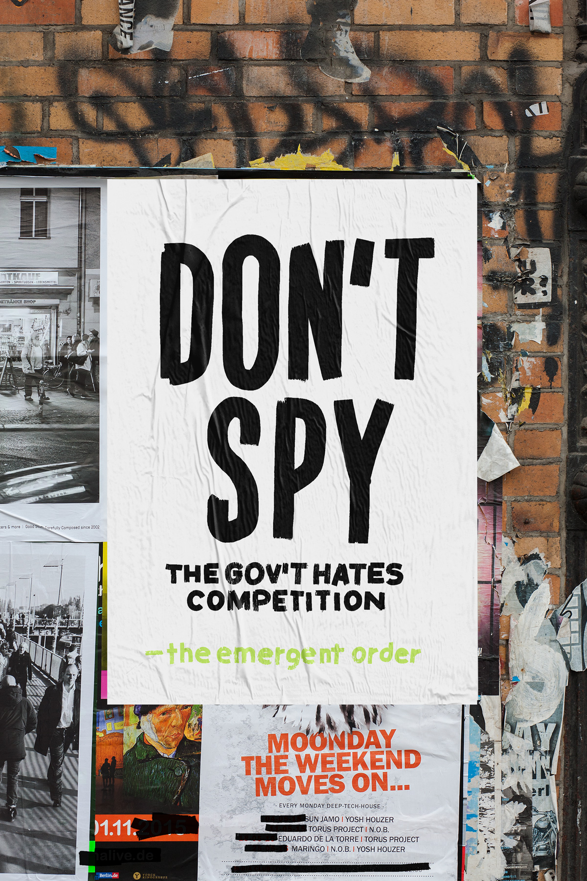
All told, our team created five posters, 9 puzzles, a web-app, an intro video, and several fake book covers. To bring the whole thing to life, I worked with our Art Director to generate a brand identity and a look-and-feel for the game's villain (the National Department of Communication and Cooperation) as well as for our plucky, hacker heroes.

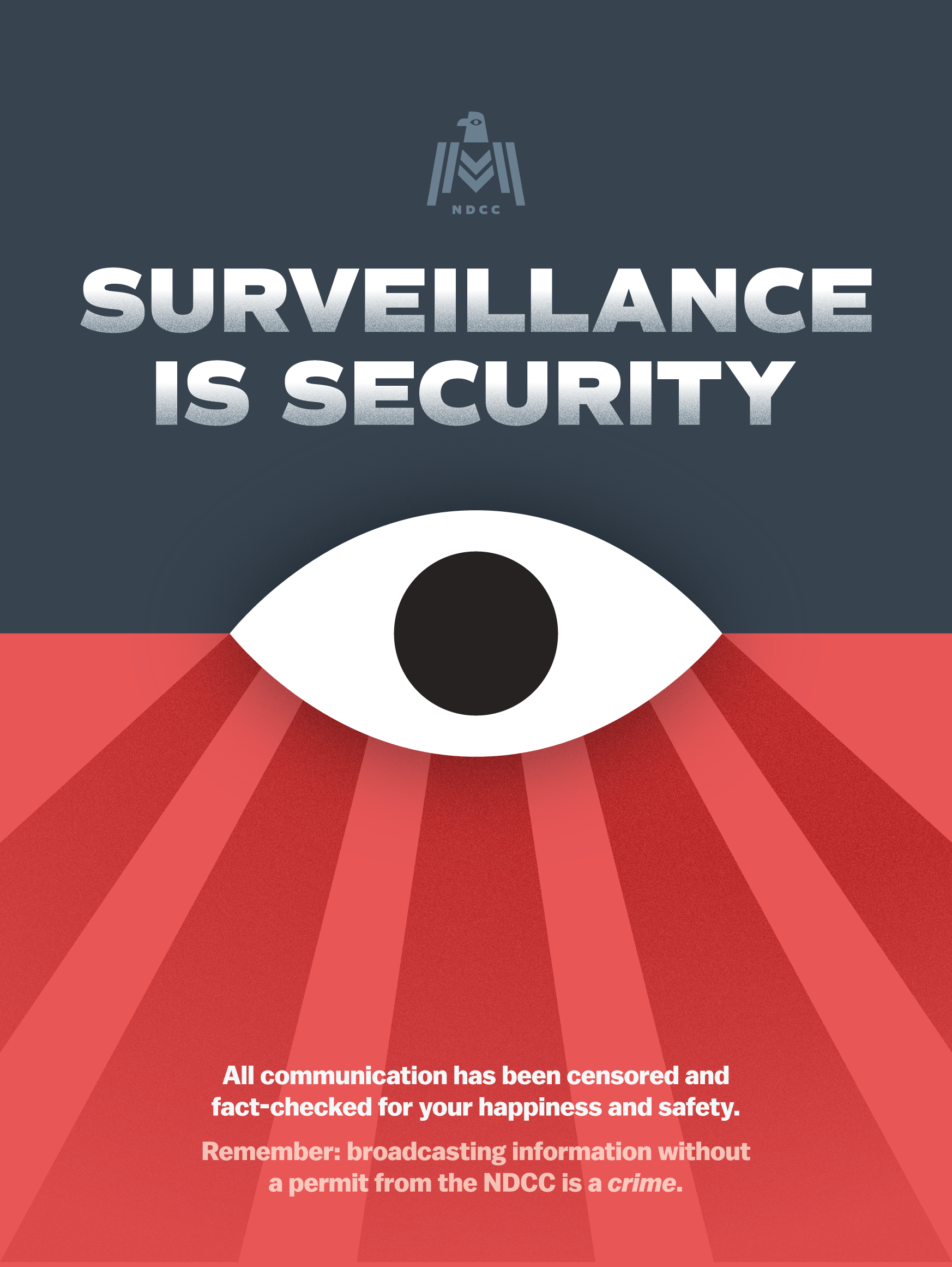
The brand not only created a real, visceral world for our users to play in — it also helped separate the busy hotel decor from our game. With a great visual identity and strong visual consistency, it was easy to quickly discern which items were part of the game, and which were part of the hotel.

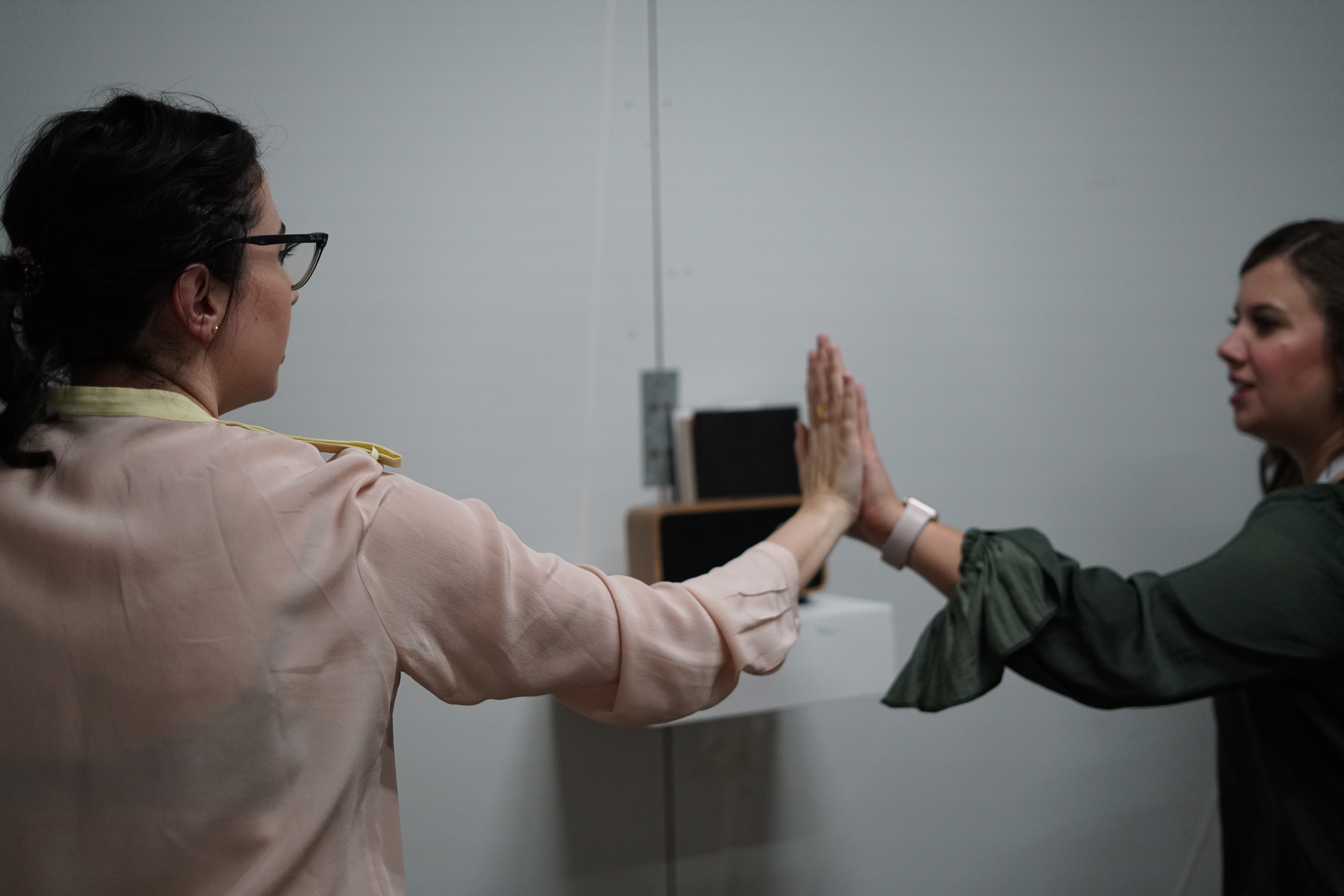
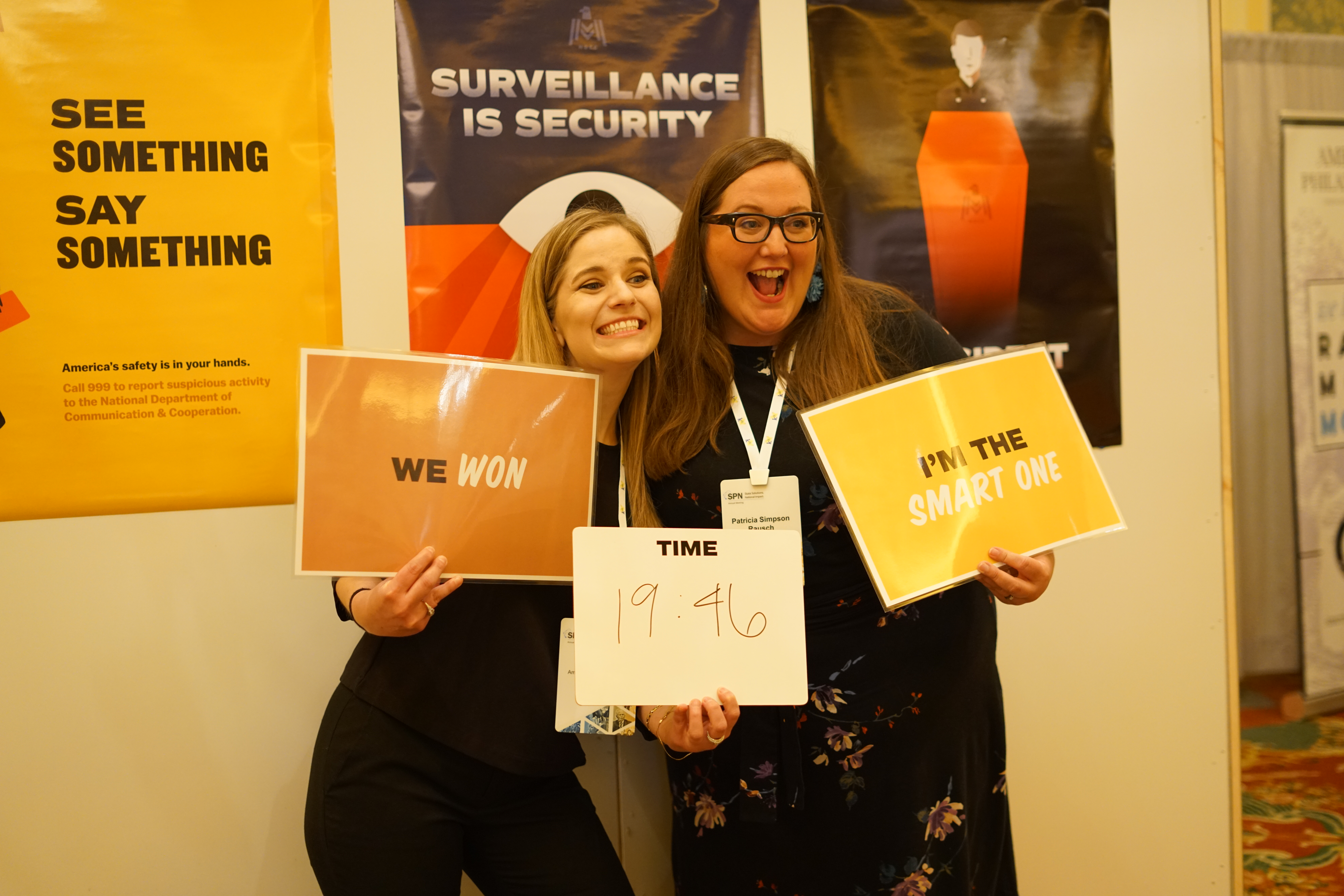
The Final Product
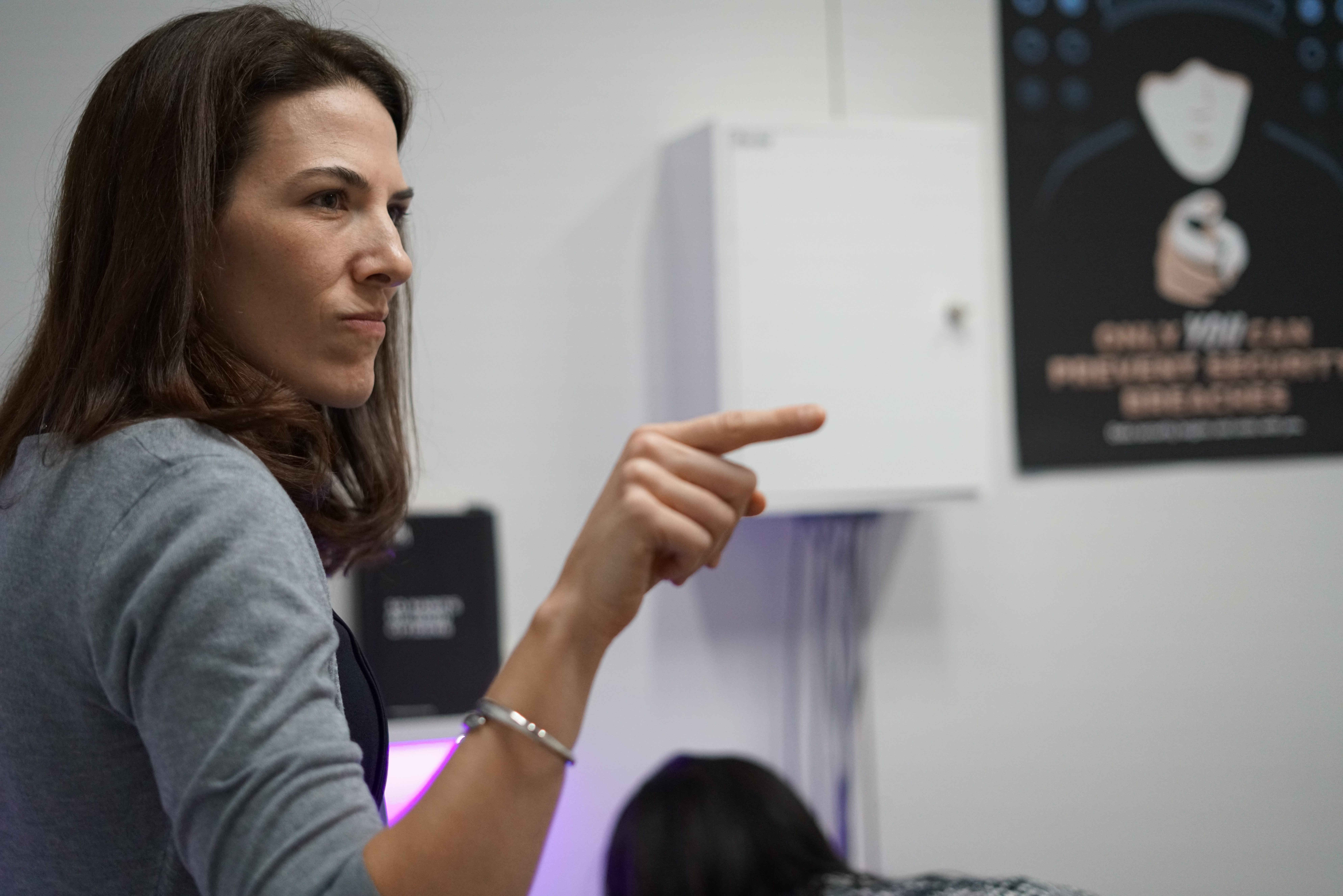
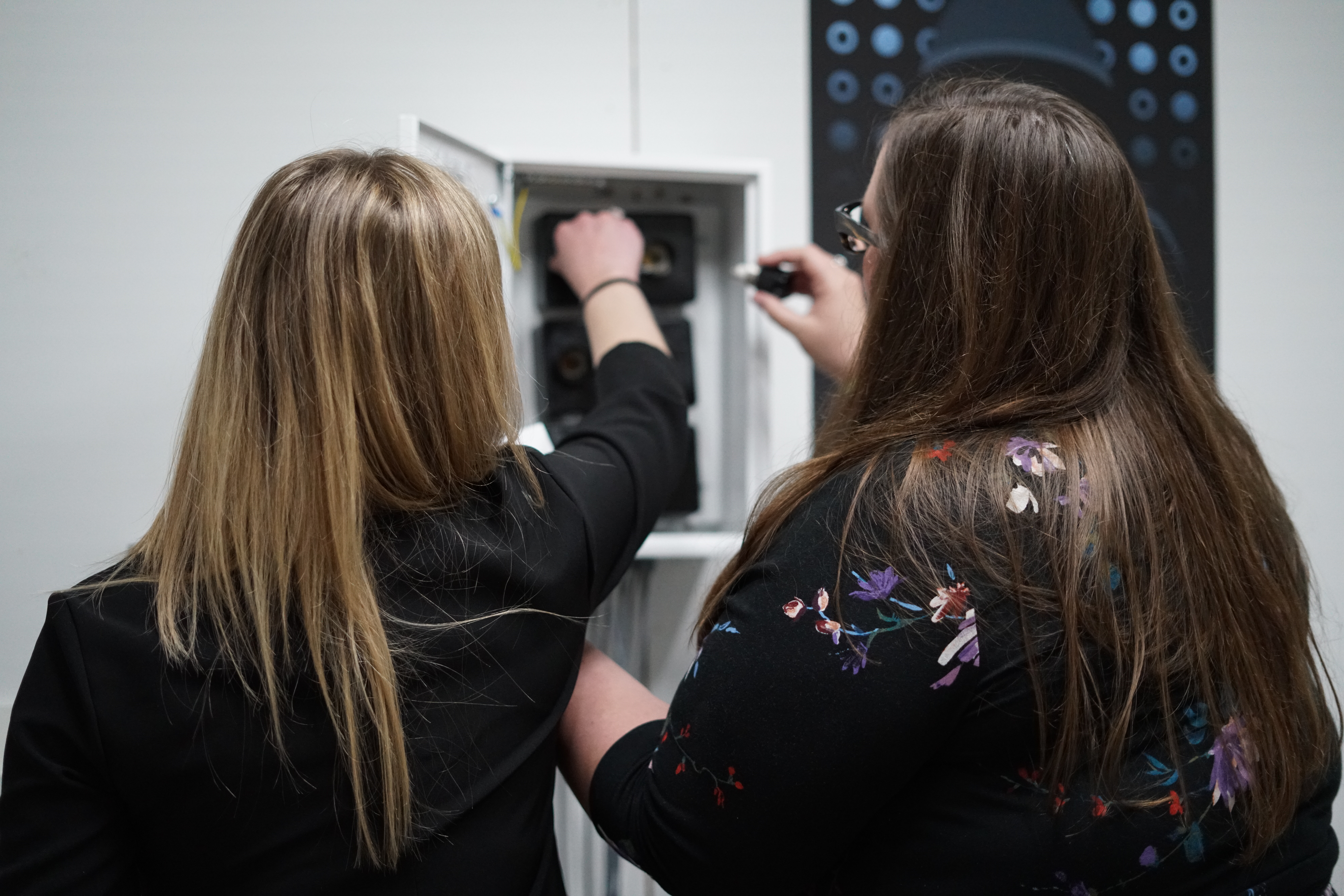
All told, we had about 100 people come through our escape room, and the schedule was completely booked the entire time. About 80% of our audience successfully beat the game, and even those who didn't relayed to us that they had fun.
A few of the best photos of the game:

.jpg)